Web design is an art form that offers viewers a blend of visual and functional experience. It makes navigation around the website pleasing, interesting, and useful. However, while designing a website there are certain vocalized and implicit rules the web designers need to follow.
Ignoring these rules can make the site lose its high-quality traffic. Small business owners plan to design their own website for several reasons like save money or have control over their projects. At times, they don’t grasp a good web designing concept that leads to a less than ideal web design.
Your competitor’s website not just looks awesome, but is rich in functional features. The efforts they made in designing the website successfully attracted visitors. Poorly planned or built website hardly meets your expectations or soon you see visitor numbers declining. It indicates your website’s potential is hampered due to some designing mistakes. You need to identify and fix them.
You can even take help from professional digital services like Mementor. The designers have experience and knowledge about how search engines will factor your page, and users will behave on your website. You can avoid common web design mistakes that drive away potential customers.
1. Good visuals with poor layout

Web design is not just soothing colors, attractive images, and pretty fonts. It is more beyond this visual aesthetics. Visuals are important, so are the easily interactive functions that help the users. For example, a beautiful website attracts visitors, but if they cannot locate the buy button, then how will they buy your product.
The best website has to be both – attractive and functional!
2. Concealed navigation
Navigation problems kill user experience and website popularity. In this digital era, where everything gets delivered instantly, you can expect visitors to abandon your site, if the navigation menu is difficult to find.
Make navigation easy to see and understood!
3. Too cryptic

Minimal design is the hot trend but needs to be done correctly. If too much is left for imagination, it is a huge mistake. Visitors need to get familiar with your business and how it resolves their issues. Depending on a lot of imagery without clear direction leaves visitors guessing, which is bad?
Avoid being overly mysterious!
4. Too crowded
It is nice to portray pertinent information about your brand. It allows visitors to get familiar with your business. Sometimes too much gets crammed, which creates confusion in the visitor’s mind and they leave in a few seconds of arrival. Nothing scares visitors faster than the landing page with graphics and pictures that take very long to load. Hefty themes, modules, and plugins can also hamper the loading time.
Stay away from busy designs and test website loading time regularly!
5. Too confusing

There is a thin line between too much [overly crowded website] and too little [overly mysterious website] called ‘confused website’. It features varieties of color palettes, typos, themes, and images. Not one related to each other. It can be because you haven’t a slight idea of what your brand image should be. You liked several design templates, so you desire to use each one of them. It may even occur when you are trying to convey multiple ideas simultaneously.
Ensure to choose and stick to a single theme, logo, and typo across the web design!
6. Call-to-action above the fold
The call-to-action placement is above the fold so that there is no need for visitors to scroll down. It is a misconception because the purpose of each web page is different. The CTA placement that works well on one page will not necessarily yield positive results on the other. For example, the homepage goal is to introduce your brand in brief. Therefore CTA works well above the fold to grab attention and encourage visitors to learn more.
On the other hand, the contact page goal is to help visitors and inspire them to buy. Generally, people wish to gain more information about your brand before making a purchase decision. Therefore requesting them to purchase before they even gained any information about what they are buying – is hasty and untimely.
CTA placement has to align with the goal of the web page!
7. Broken links slip through
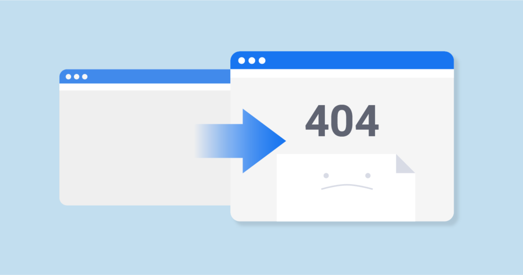
Broken links don’t lead anywhere. It is an error page, which needs to get closed or you hit the back button. Broken links occur when URL is incorrectly typed or the target page was removed. Broken links easily slip through gaps and reside for months or years, before you identify they are broken. It frustrates the users and even search engines.
Remove broken links to keep users on-site and maintain your Google ranking!
8. Lack of mobile-friendly features
There is a delusion that mobile sites need fewer features than their desktop counterparts. Actually, a feature that is essential for desktop users is just as significant as for the mobile audience. In general, if desktop users don’t find the same features on their mobile devices they get frustrated. It is ok if your mobile version layout differs, so prioritize the crucial features and avoid intrusive pop-ups, carousel banners, QR codes, etc.
Remember, a mobile-friendly site helps to keep your massive users engaged, so never scale down mobile websites!
9. Over convincing visitors, you are the BEST

Content is not for a sales pitch. It highlights your business key points in a confident tone. There is no need to push visitors to buy your product saying it is worth trying and a valuable solution. Your content aims to connect with visitors on an emotional level. It is your brand voice that attaches readers emotionally and they will make the buying decision.
The website content aim is to ‘Connect’ and not ‘Sell or convince’!
10. Ignored HTTPS
HTTPS certificate is regarded as safe. HTTPS encrypts the data sent from your website to the user and vice versa. Criminal minds or scammers cannot intercept valuable sensitive details. Users directly see whether your website is safe or not on their browser.
Ensure to get a valid HTTPS certification for offering users a secure environment of shopping on your website!